The following home office designs with bold colours will not suit everyone, but that’s ok, because they suit the owners of these workspaces just fine.
Why is it always so hard to find a colour you like? In fact, although your eyes are attracted to colour, your brain doesn’t like it very much. Could it be that the way you use colours in your home office can affect your mood?
We often have to work harder and longer to achieve the look of a certain colour than other colours do. In fact, our attention span for certain colours tends to be short — and if we don’t use them correctly (like on the walls), we might lose interest before our eyes have even had a chance to adjust.
This isn’t just an aesthetic issue: if designers always chose white as their primary colour palette, or used neutral shades instead of warm tones, they wouldn’t be able to tell where one part of their design ends and another begins. Our mind is also wired for patterns — especially when things are off-kilter or random enough; so when something stays out-of-place, we get distracted very quickly by “disturbing” stimuli.
Choosing bold colours for your home office
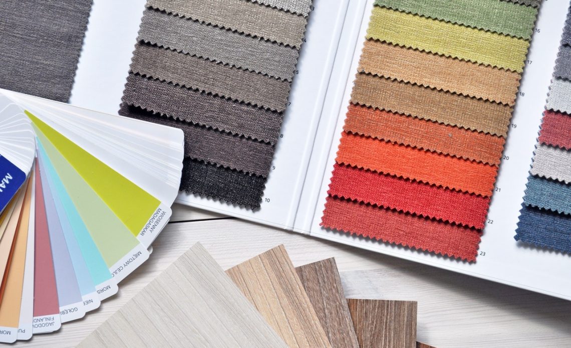
Colour is one of the most important aspects of a design. It may seem obvious, but it’s easy to forget that we need to think about colour when choosing our products, too. There are so many factors involved in choosing the right colour for your website, from whether you want it to grab attention to how it will look on the site’s display.
For example, you may want the colour to be bold and contrasting on a white background, so that visitors feel like they are getting away with something. The flip side would be that it’s too bold and there’s no way people will be able to read it. This is why your choice of colours should complement your furniture and any art or rugs in your home office.
Amazing home office designs with bold colours
Now let’s look at this curated list of home office designs with bold colours – which one or two stand out the most for you, and why?
Purple people eater
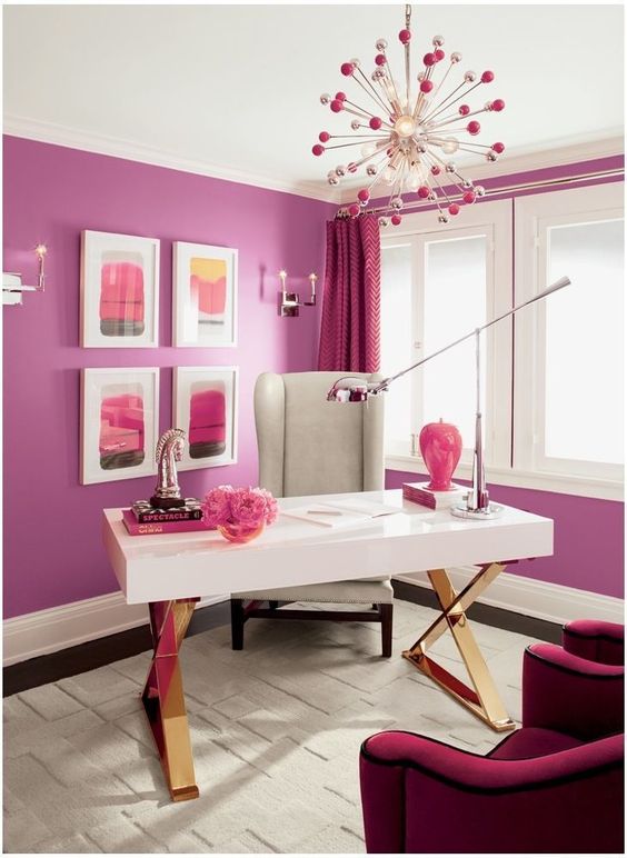
Purple home office (Source)
This pink and purple palette sure stands out! I would love to have seen the rest of the home too, to see if the colours here are also reflected elsewhere in the interior design.
Dark wallpaper
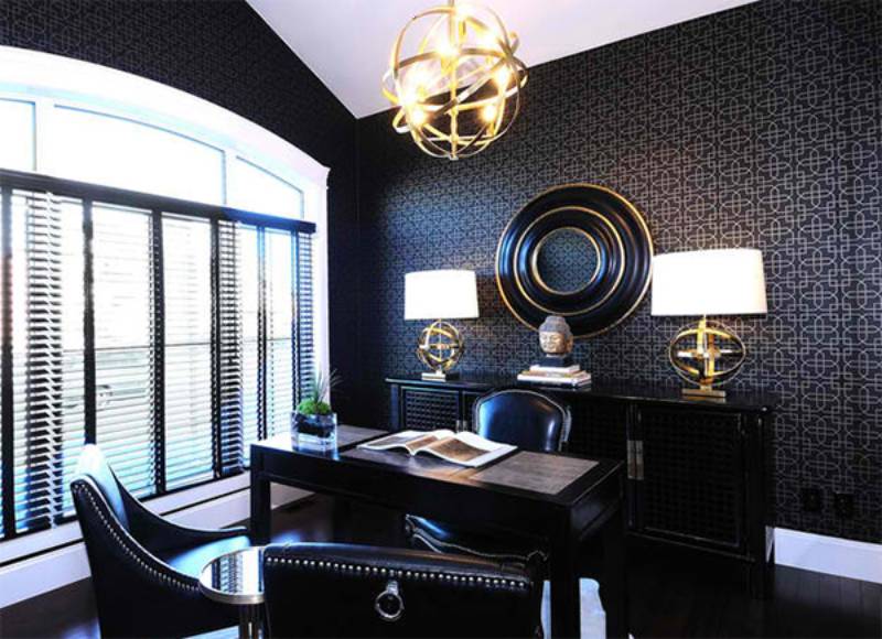
Dark wallpaper (Source)
When we think of home office designs with bold colours, we often assume it needs to just be a bold solid colour. This example of patterned wallpaper shows it doesn’t always have to be.
Comma design
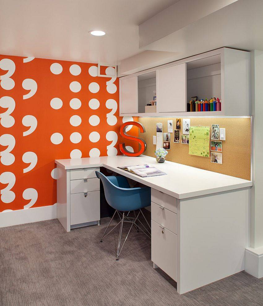
Home office with comma wallpaper (Source)
I love punctuation in writing, and it is good to see when it has been used well. However I have never seen it incorporated into a wall before, and this looks great! Perhaps this home office is the lair of a writer or editor? In any case, the bold symbols add a playfulness to the room.
A splash of pink
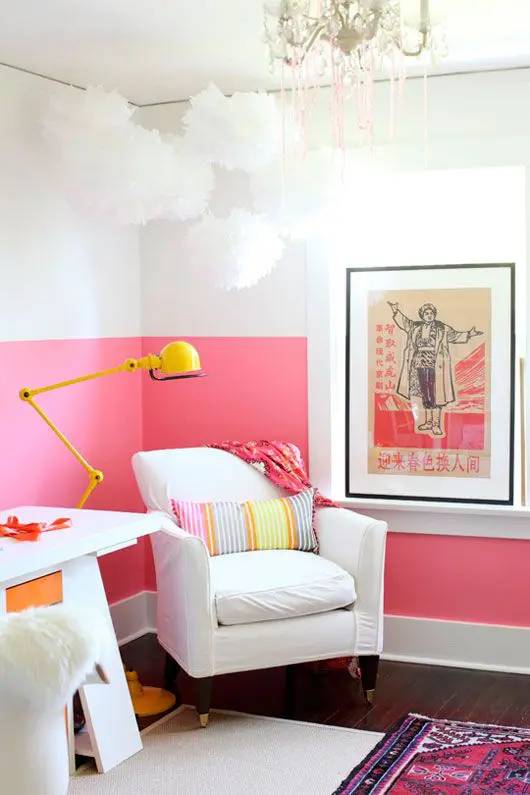
Pink and white home office (Source)
This home office has an interesting two tone interior, with a bright pink covering the bottom half of the walls. This works well with the floor rug which also has a similar colour palette.
Blue (and frames!)
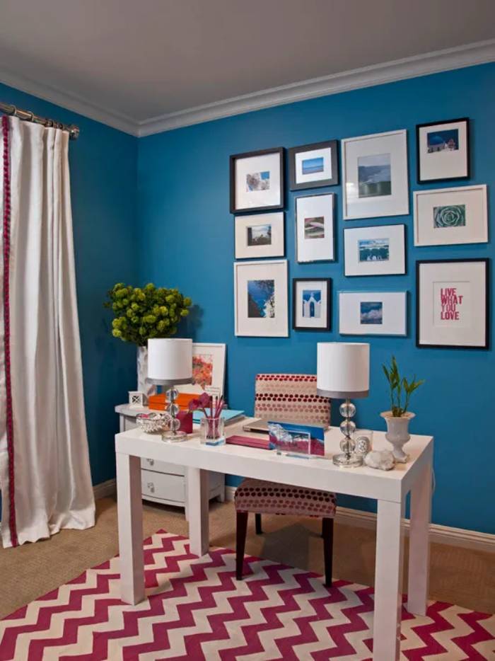
Bold blue home office (Source)
The coastal vibe of the blue walls, the zig zag of the rug, and all wrapped up with a gallery of frames. The desk position is intersting too, not against the wall as you may expect, but rather the opposite.
Blackboard paint
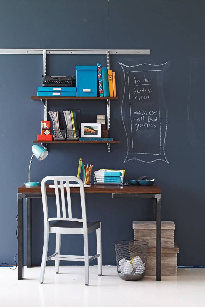
Blackboard paint (Source)
There’s always room for a message or shopping list, when your whole wall is painted with blackboard paint. This would be perfect for a student or teenager for their study area as well.
A tasty lime
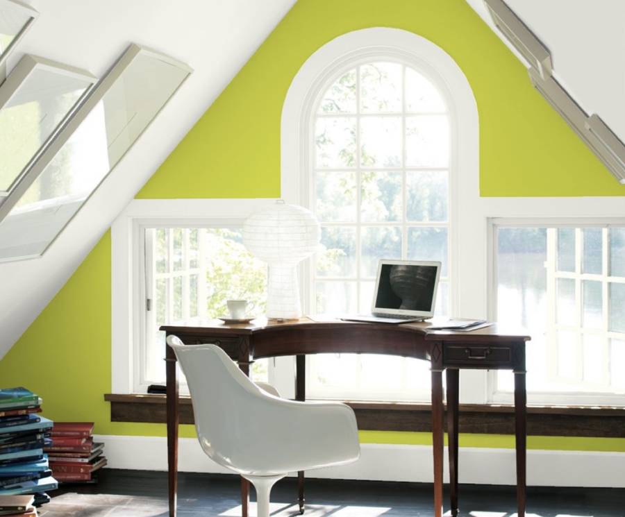
Lime colour office (Source)
I have always been a fan of lime, and this room just draws my attention, a lot. The combination of triangular windows and ceiling, the retro office chair and the wood all help to tie this workspace together, beautifully.
Yellow and black
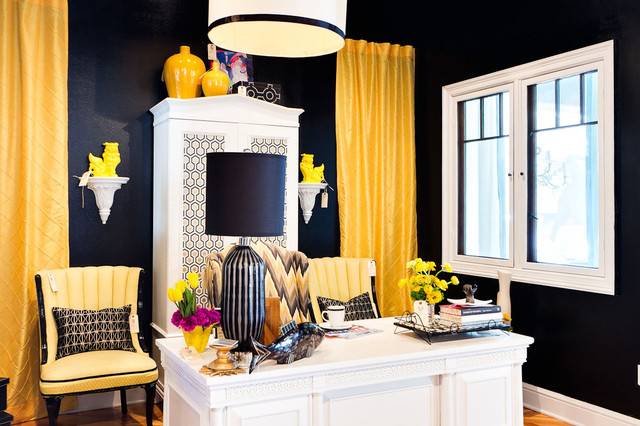
Yellow and black home office (Source)
The walls, drapes and even the chair and fresh flowers are all tied in to the same two colour theme here. Is it too much? I feel like I would be happy for half a day, and then it would start to annoy me, but that’s my own personal taste.
Geometric wall
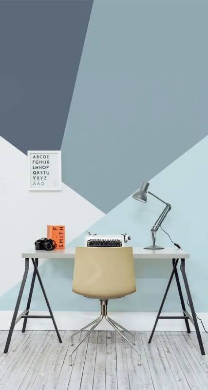
Geometric wall design (Source)
It can be easy when you have a small home office, to just paint a solid colour and be done with it. This is a great example of taking a different perspective and it working really well.
Bold and sassy
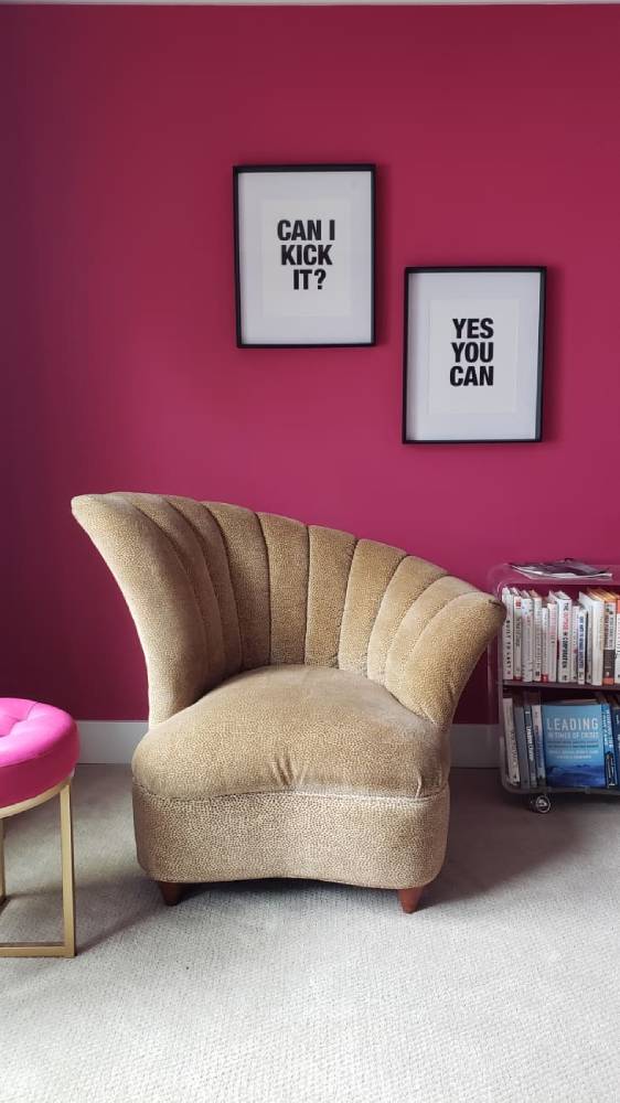
Magenta home office (Source)
The magenta is playful enough, and then we have the famous lyrics from the song by A Tribe Called Quest (here’s their music video). The cool chair also adds a statement, and it all wraps into a place you can’t help but smile at.
Ochre with shelving
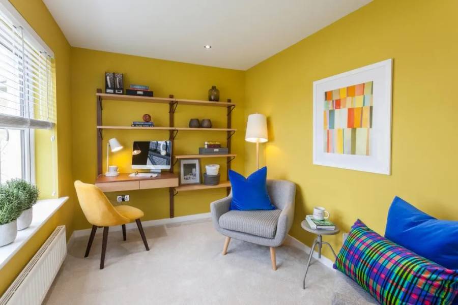
Ochre home workspace (Source)
I am always happy to see when a piece of wall art ties in nicely with the colour scheme of the room. The pillows and furniture have also been chosen very carefully to work in unison with the very bold walls.
Jungle office
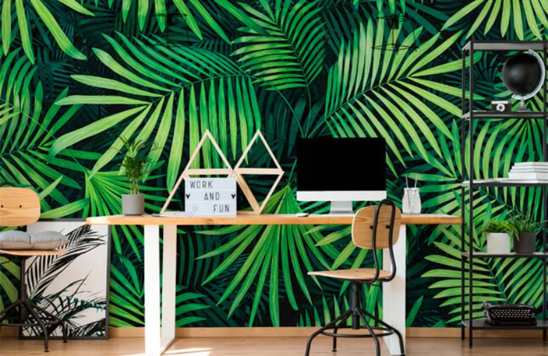
Jungle home office (Source)
In previous articles here, I have written about the beauty of indoor plants and how they bring a sense of nature inside with you. This home office feels like you are in the middle of a jungle, thanks to the large mural or wallpaper behind the desk.
More about the use of colour in interior design
Colour is one of the most powerful and emotive aspects of a product. The colour of a room or interior can make or break your mood.
If you are looking for subtlety, then take a look at how colours are used in bookshelves (or even walls). They can really set an atmosphere (and mood) in the room; they help orient visitors to the right space and give them an idea of where they should go next.
Over time, colour trends tend to happen in waves: from bright orange carpet tiling to dark blue walls, from painted fabric curtains to black linen bed covers. We see these trends come and go over time as designers try to get the most out of their materials and budgets.
For some reason, bold colour schemes that change with no rhyme or reason are still very popular (and beloved by many). And since red can be so much more dramatic than any other colour on paper. Colour theory is a subject that has fascinated, bewildered and mystified people for centuries. It’s a subject that some might characterise as “too complicated” to understand.
You could use it as part of decoration (e.g., on your wall). You could paint your walls with colour — or rather, you could have someone else do it for you (designer or not). Or if you have time and money, you could hire a professional to paint your walls or complete the project yourself.
The point here is that colour is beyond just decoration; if you spend time looking at the world around us through the prism of colour theory, you’ll see that it can be used to create focal points in our lives and add depth and interesting details wherever we put them.
In Summary
The above home office designs with bold colours are fantastic to see, and I trust that some of them inspired you to consider a more bold approach to interior design.